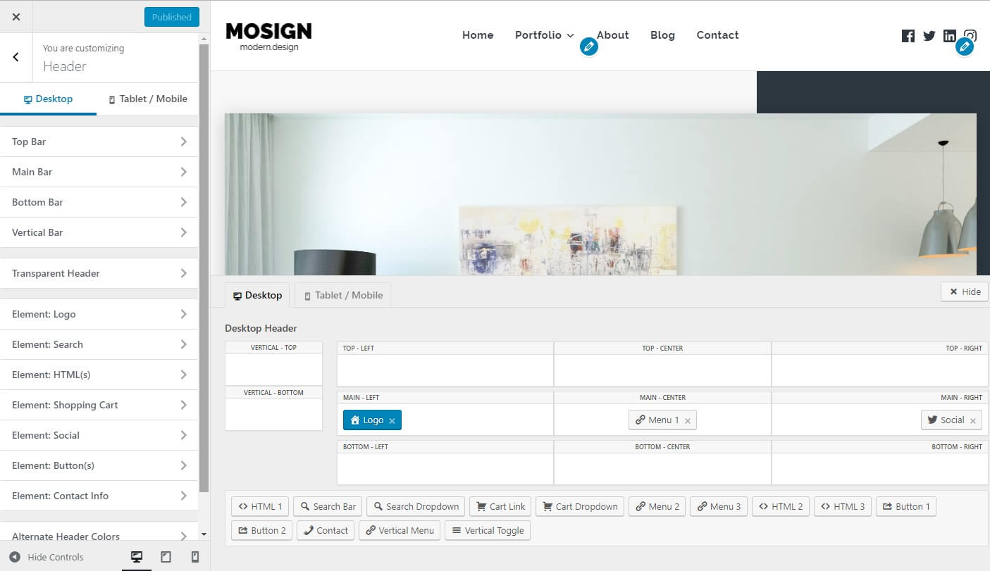
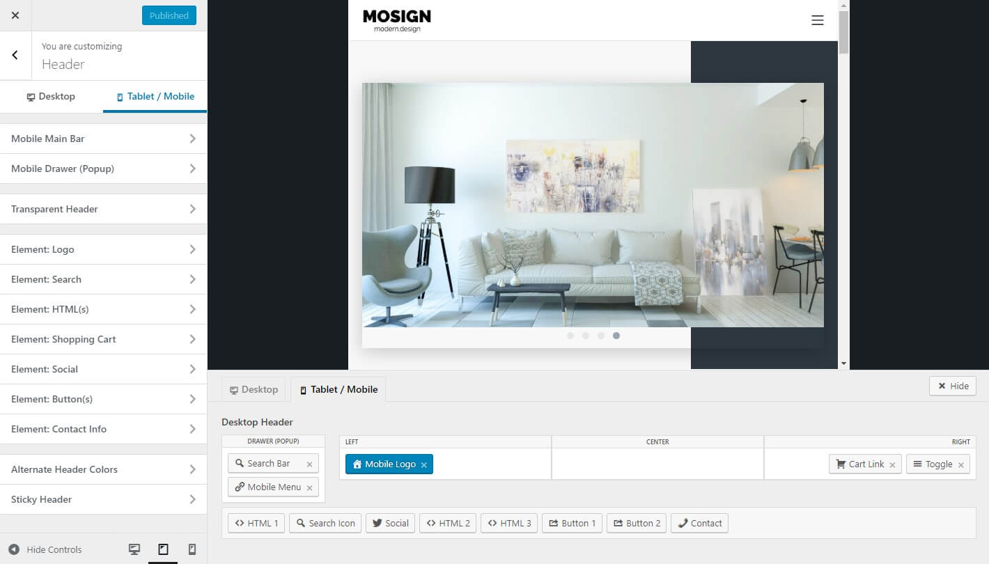
Suki has Header Builder feature that gives you full control to set layout of your header in desktop, tablet, and also mobile devices. To open Header Builder you can go to Appearance > Customize > Header.
Desktop Header Builder

In Desktop Header, you have 3 header section:
- Top Bar
- Main Bar
- Bottom Bar
The available options for each header section are:
- Merge inside Main Bar wrapper ( Top Bar and Bottom Bar only )
- Layout
- Height
- Padding
- Border
- Spacing between elements
- Text typography
- Menu link typography
- Submenu link typography
- Icon size
- Background color
- Border color
- Text color
- Link text color
- Link text color :hover
- Link text color :active
- Submenu background color
- Submenu border color
- Submenu text color
- Submenu link text color
- Submenu link text color :hover
- Submenu link text color :active
- Top level menu items highlight
- Highlight color :hover (if you set the top level menu items highlight)
- Highlight text color :hover (if you set the top level menu items highlight)
- Highlight color :active (if you set the top level menu items highlight)
- Highlight text color :active (if you set the top level menu items highlight)
You have 11 different locations where you can put the header elements:
- Top Bar Left
- Top Bar Center
- Top Bar Right
- Main Bar Left
- Main Bar Center
- Main Bar Right
- Bottom Bar Left
- Bottom Bar Center
- Bottom Bar Right
- Vertical Bar Top (available in Suki Pro: Vertical Header)
- Vertical Bar Middle (available in Suki Pro: Vertical Header)
- Vertical Bar Bottom (available in Suki Pro: Vertical Header)
At the bottom of header builder, you’ll find the list of unused header elements. Simply drag and drop the element you want into header location..
Here are the list of header elements that you can put into Desktop Header Builder:
- Logo
- Header Menu 1
- Header Menu 2 (available in Suki Pro: Header Elements Plus)
- Header Menu 3 (available in Suki Pro: Header Elements Plus)
- Search Dropdown
- Search Bar
- HTML 1
- HTML 2 (available in Suki Pro: Header Elements Plus)
- HTML 3 (available in Suki Pro: Header Elements Plus)
- Social Icons
- Shopping Cart Link (if WooCommerce is installed)
- Shopping Cart Dropdown (if WooCommerce is installed)
- Button 1 (available in Suki Pro: Header Elements Plus)
- Button 2 (available in Suki Pro: Header Elements Plus)
- Vertical Header Toggle (available in Suki Pro: Vertical Header)
- Vertical Menu (available in Suki Pro: Vertical Header)
- Contact Info (available in Suki Pro: Header Elements Plus)
Mobile Header Builder

Suki also has dedicated Mobile Header layout which will replace the Desktop Header on tablet and mobile devices.
In Mobile Header, you have 4 different locations where you can put the header elements:
- Mobile Main Bar Left
- Mobile Main Bar Center
- Mobile Main Bar Right
- Mobile Drawer (Popup)
Here are the list of header elements that you can put into Mobile Header Builder:
- Mobile Logo
- Toggle (for triggering Mobile Drawer)
- Mobile Menu
- Search Icon
- Search Bar
- HTML 1
- HTML 2 (available in Suki Pro: Header Elements Plus)
- HTML 3 (available in Suki Pro: Header Elements Plus)
- Social Icons
- Button 1 (available in Suki Pro: Header Elements Plus)
- Button 2 (available in Suki Pro: Header Elements Plus)
- Contact Info (available in Suki Pro: Header Elements Plus)
The Mobile Drawer (Popup) location will be displayed when Toggle element is clicked. So you need to add the Toggle element somewhere in the Mobile Main Bar.
Note: Some elements are only allowed to be put into some specific locations.
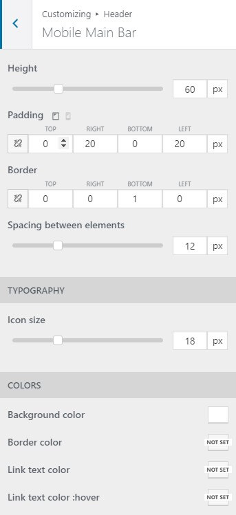
The available options for mobile main bar are:
- Height
- Padding
- Border
- Spacing between elements
- Icon size
- Background color
- Border color
- Link text color
- Lint text color :hover

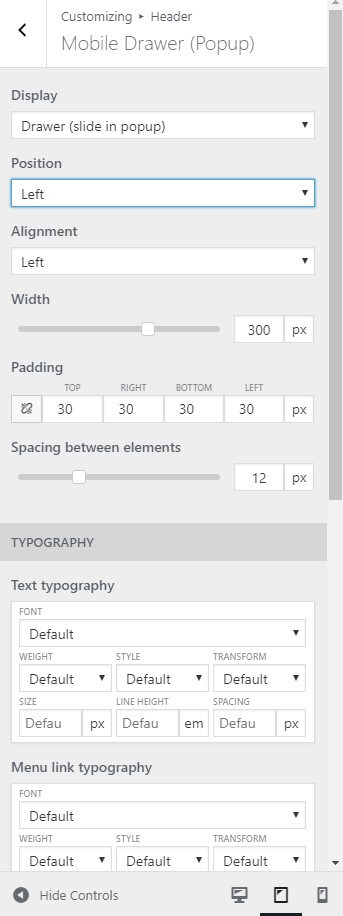
The available options for mobile drawer (popup) are:
- Display
- Position
- Alignment
- Width
- Padding
- Spacing between elements
- Text typography
- Menu link typography
- Submenu link typography
- Icon size
- Background color
- Border color
- Text color
- Link text color
- Link text color :hover
- Link text color :active
